I’m a big fan of css flexbox; I think I probably overuse it. I think of flexbox first every time I need two divs to be side by side and to be forced to have the same height. An alternative solution to that problem is to use tables. It goes without saying why that’s not ideal. And even aside from the obvious reasons, it’s easy to make the two side-by-side divs become one on top of the other on smaller screen sizes with flexbox; not so easy with tables. Flexbox is perfect for that kind of responsiveness.
####So, here was my goal:
####And here’s how I thought it should be acheived:
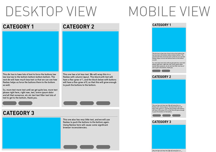
Category 1

This div has to have lots of text to force the buttons low low low low to the bottom bottom bottom bottom. The next div will have much less text so that we can see how flexbox helps us force the buttons there to the bottom as well.
So, more text more text until we get quite low, more text please right here, right now, text, lorem ipsum dolor and all that nonsense, etc etc text text filler text lots of text to get to the bottom, thank you.
Category 2
This one has a lot less text. We will wrap this in a flexbox with column layout. This block with text will have a flex-grow of 1, and the block below with buttons will have a flex-grow of 0, so that this will grow enough to push the buttons to the bottom.
Category 3
If you’re not viewing this in Chrome, it may look wrong. That’s the point of this post.
Here’s the basics of how it’s supposed to work:
I won’t go into the ins and outs of what I did there, but I’ll explain it briefly. Category 1 and Category 2 are wrapped in a div that has display:flex applied. Implicitly, they have align-items:stretch applied to them, which forces the shorter of the two to take the height of the larger of the two when they’re on the same row. I have the divs set to a width of 49% and the parent div set to justify-content:space-between so that there’s a 2% margin between the two. I have it set to flex-wrap:wrap and at a breakpoint of 770px screen width I change the Category 1 and 2 divs to width:100% so that they stack on top of each other. They have a margin-bottom of 2% to match the gap between them.
Each of Category 1 and 2 are also given display:flex, but, crucially, flex-direction:column. I use this to force the buttons to the bottom of the one with less text. The buttons are put in a div that has a flex:grow of 0, while the description paragraphs are put in a div that has a flex:grow of 1, so that div takes up any remaining space to push the buttons to the bottom.
I used a similar technique for Category 3. The image is in one div, and the buttons and paragraphs in another. The wrapping div is set to display:flex and at the breakpoint, I change it to flex-direction:column so that the image goes above the text and buttons on small screens. The buttons and paragraphs are themselves wrapped in another div which works just the same as the ones above to force the buttons to the bottom.
Now for the screenshots of how different browsers handle this:
####Chrome on Mac (identical on PC), Desktop View and Mobile View:
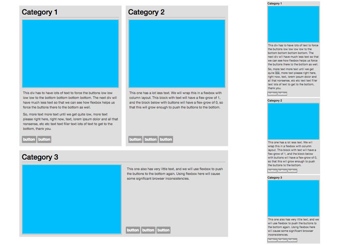
Chrome does just what I would have expected. Now, I developed this solution on Chrome so there’s maybe a bit of a bias there – of course Chrome does what I expect, because in a way Chrome defines my expectations.
However, I think the differences that other browsers have (which you’ll see in just a bit) can be argued to be mistakes; behaviours which you wouldn’t expect given the css.
####Firefox on PC:
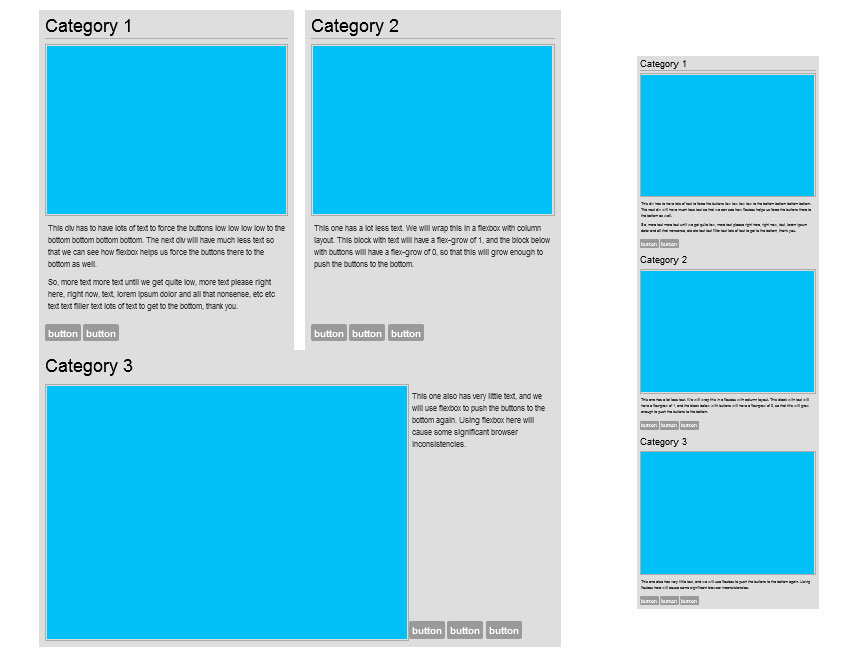
The first thing to notice is the margin-bottom of 2% on the upper 2 categories is ignored. If I change it to a pixel value, it works.
The second thing to notice is the huge problems with the Category3 Display. It displays correctly in the mobile view (the only problem there is, again, the ignoring of the bottom margins), but in desktop view the image takes up too much space. I have the div that contains the image set to flex: 0 1 49% which means it should not grow from 49% of the width, but it’s clearly taking up way more than 49% of the width. It’s taking up what I can only assume to be the full width of the image.
####Internet Explorer on PC:
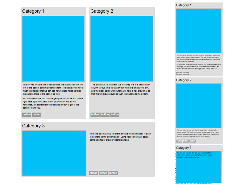
This displays just fine in Desktop view, but looks really really wonky on Category 3 in mobile view. When I change the container div on Category 3 to flex-direction:column, the text starts overlapping the image for some strange reason.
I figured out some fixes for the Firefox issues (not the IE one), but I’m not going to post them here because that’s not the point of this post. The fixes are workarounds for the annoying problem that shouldn’t exist: inconsistent handling of css between browsers. I’m a bit spoilt in that regard: I started getting interested in web design just at the tail end of when people were still regularly designing for compatibility with IE 6. That wasn’t a part of my life for very long, and I don’t want it to be a part of my life again.