Introduction
I’ve been intrigued by what I’ve read of Flexbox in css since I first heard of it, but I’d never read any clear writeup about how to use it effectively and I didn’t really have the time to experiment. I finally came up with a usecase for it, though – an excuse to get my hands dirty and try it out – and in the context of this blog no less! This post is a walkthrough of my experiments with using display: flex and the css properties that go with it to hopefully create an attractive post display.
My Goal
My goal is to create a way to present a post-list that has the following features:
- The posts in the post list should have an image, a title and an excerpt.
- The posts should be arranged in responsive rows (following a specific pattern which I will show below)
- The posts in a row should all be forced to have the same height as each other
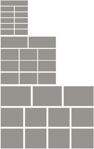
The pattern that the responsive rows should follow is this:
There will be 11 posts, and in all variations of the display, the first row of posts should be bigger than the latter rows. On wider screens, the first row should have 3 posts and the others 4; on medium screens, 2 posts for top row and 3 for the rest; on small screens, 1 post on top and 2 for the rest. All of these patterns fit 11 posts perfectly.
First Try

post title
post description. Make this description extra long to show that the other boxes on the same row take up same vertical space.
post title
post description
post title
post description
post title
post description
post title
post description
post title
post description. long sentence lorum ipsum long long sentence yes indeed
post title
post description
post title
post description. Another extra long one to prove my point. Long sentence long sentence blah blah blah
post title
post description
post title
post description
post title
post description
I’m not going to detail the full css - you can look at the source code for that - but I’ll talk about the important bits. First the html:
<div class="first-try flex">
	<a href="">
		<img src="https://flanneljesus.github.io/assets/images/postlistimg.jpg" alt="post list image">
		<h3>post title</h3>
		<p>post description</p>
	</a>
	... 10 more of those ...
</div>
To get the effect, first I set the outer div to display: flex, flex-wrap: wrap, and justify-content: space-between. The a tags are set to display:block though I don’t think that was necessary. Then I define the widths of the a elements, .first-try > a. I am using the ‘calc’ css which helps me to acheive precise distances between the a blocks but I set a fallback % width first. The specific details of those are not really relevant – it’s fairly straight forward, when I need 3 posts in a row, I have the width be a little under 33%, when I need 4 posts, a little under 25%, and when I need 1 post, 100%, etc.
It works beautifully – very beautifully! They’re perfectly spaced apart, each post block on the same row is forced to have the same height! What can go wrong?
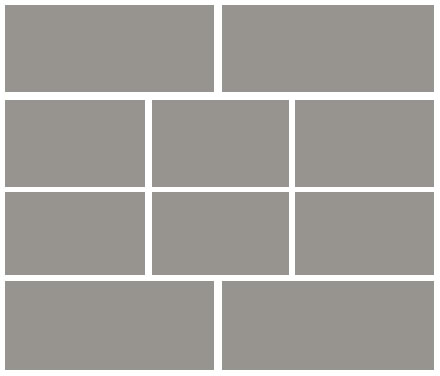
Well, I thought about it and realized that if I’m paginating my posts to 11 posts per page, the first pages will have 11 posts but the last page will usually have fewer. When you take off a block – try it in your dev-tools – the last row looks funky. The justify-content: space-between style messes it up, produces the following result:

So when there are fewer blocks on the last row than on the last above, instead of the blocks essentially ‘floating’ left like you’d want them to, the space gets distributed evenly between them.
Now, it might be that using display:table solves my problems – I don’t know. It might be that display table forces the blocks to be the same height, and – this is the part I doubt, which is why I went to flex in the first place – allows for a responsive number of blocks that changes based on the width of the container. I’m pretty sure that I can’t have a variable number of blocks per row with display table, with cell widths that are different for the top row than for the other rows.
I’d like to know if display:table can meet all my needs – I know just the standard float:left can’t, and I’d have a helluva time trying to get the bootstrap grid classes working to my favor (and I’m looking into flexbox largely to avoid bootstrap classes) – so please comment if table a feasible way to do it. But for now, I’m just focusing on the flexbox model. I’m going to try again, this time using a very different approach and avoiding justify-content: space-between or the even more-problematic space-around.
Second Try
post title
post description. Make this description extra long to show that the other boxes on the same row take up same vertical space.
post title
post description
post title
post description
post title
post description
post title
post description
post title
post description. long sentence lorum ipsum long long sentence yes indeed
post title
post description
post title
post description. Another extra long one to prove my point. Long sentence long sentence blah blah blah
post title
post description
post title
post description
post title
post description
For this one, I took off justify-content as that was the failure in the last one. Instead I tried to acheive the full result by setting flex-grow and flex-shrink to 1, setting some minimum widths, and setting an appropriate flex-basis for everything.
It looks very much the same as the above result – same breakpoints even – but this time has a different reaction when there are fewer than 11 blocks. Because the flex-grow is set to 1, if there is less than a full row of boxes on the final row, the box or boxes that are there will grow to take up the full width.
This is undesirable as well: like I said, I just want the last row to essentially float:left.
Another major problem with this attempt is that it seems to fail on Safari. Safari seems to have some sort of bug with wrapping flex-box when the elements overrun the container.
Third Try
post title
post description. Make this description extra long to show that the other boxes on the same row take up same vertical space.
post title
post description
post title
post description
post title
post description
post title
post description
post title
post description. long sentence lorum ipsum long long sentence yes indeed
post title
post description
post title
post description. Another extra long one to prove my point. Long sentence long sentence blah blah blah
post title
post description
post title
post description
post title
post description
This solution meets all my needs specified – the only need it doesn’t meet is that perhaps it doesn’t have quite as nice browser support as I’d like, as it depends on setting the widths of the blocks based on the result of a calc css operation. But even calc has pretty good support – in fact, it’s unprefixed support is, according to caniuse.com, greater than that of flex.
I use display:flex on the top level div, and set a margin of -6px (this is because I want a margin of 12px between each block – you’ll see later why that helps).
I set the breakpoints the same as the above ones (I break at 500px and 992px). For the blocks, I set a margin of 6px – this produces a margin between elements horizontally and vertically of 12px, and because I set the margin of the parent to -6px, it aligns with the parent’s container at the edges.
Now for the tricky part:
When I want a block to take up the full width, I use width: calc(100% - 12px). The 12px takes care of the margin of 6px on both sides. When it’s supposed to take up half width, I use width: calc(50% - 12px). When I need three, I use calc(100%/3 - 12px) – apparently the spaces around the minus symbol are very important for chrome, because it wouldn’t work until I did that. And for 4 blocks across, width: calc(25% - 12px).
Now, when I take off a block it DOES float left on the bottom row.

It works perfectly. And I’m constantly worried that the solution I’m coming up with doesn’t depend on display:flex - I think, “Couldn’t I just have done this by using float: left in the first place?” But no, I couldn’t. That wouldn’t have forced the blocks on the same row to take the same (unspecified) height. If I wanted them to have the same height, I’d have to specify that, and I think it’s much more elegant not to; to allow for a variable height depending on content.
I think I can also tweak this to make it not depend on calc: if I wrap the post blocks in a div and set their widths to 100%, 50%, 33.33% and 25%, and give those divs a padding of 6px, that may produce the same result without having to use a feature that isn’t supported as much as I’d like. However, I think it’s fair to say that if someone’s browser can support flex, it can probably support calc as well, based on the results of caniuse. And in the context of a personal blog I think we should all be a bit willing to experiment and push the envelope at least a little bit.
I hope someone finds value in these little experiments. I haven’t seen nearly enough examples of the sorts of things flexbox can help you solve. Sites like this, this and this have been incredibly helpful and entertaining for me, and I’d like to see a bit more experimentation with flexbox. I’m also quite excited to see what grid layout can achieve.